NJ TRANSIT × FIFA World Cup 26 · Digital

Making the complicated feel simple.

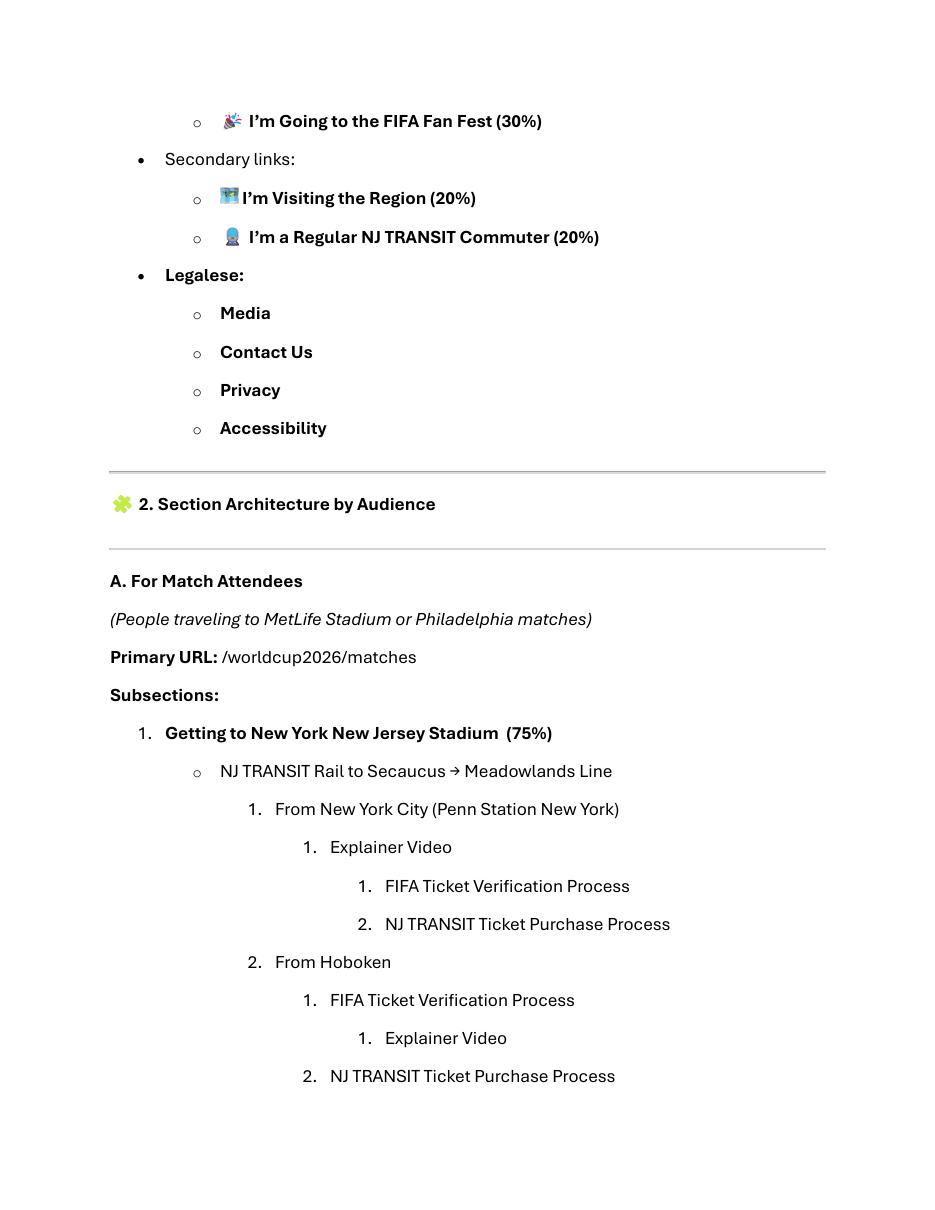
A one-stop digital experience for World Cup fans, visitors and everyday NJ TRANSIT riders navigating one of the biggest events ever hosted in the region.
Creative Direction · UX/UI · Digital · Information Architecture
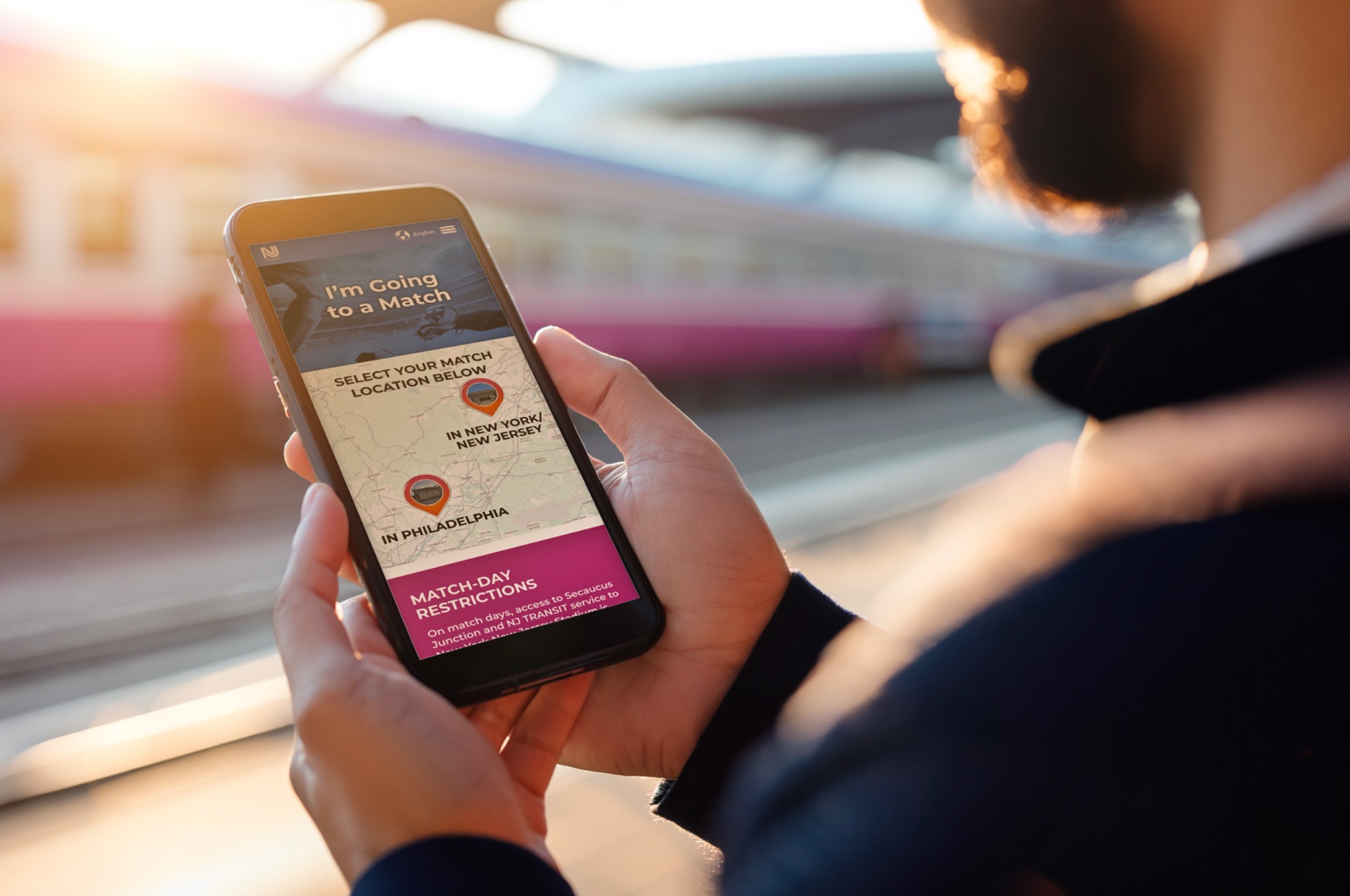
Traveler using the NJ TRANSIT World Cup mobile website at a train platform
The brief

There was a lot to figure out.

World Cup visitors needed schedules, stations, tickets, transfers and match-day information. Everyday riders needed to understand what the event meant for their normal commute. The experience also had to support a large, multilingual audience moving through an unfamiliar region.

The challenge was not finding a place for all that information. The challenge was making people know where to look.
“A lot goes in. A little needs to come out.”
The job was clarity
Mobile first

Design for the moment people actually need it.

A World Cup visitor is not necessarily sitting at a desk. They are walking through a station, checking a schedule, looking for a platform or figuring out how to get somewhere they have never been.

So the experience started with the smallest screen and the most immediate questions.

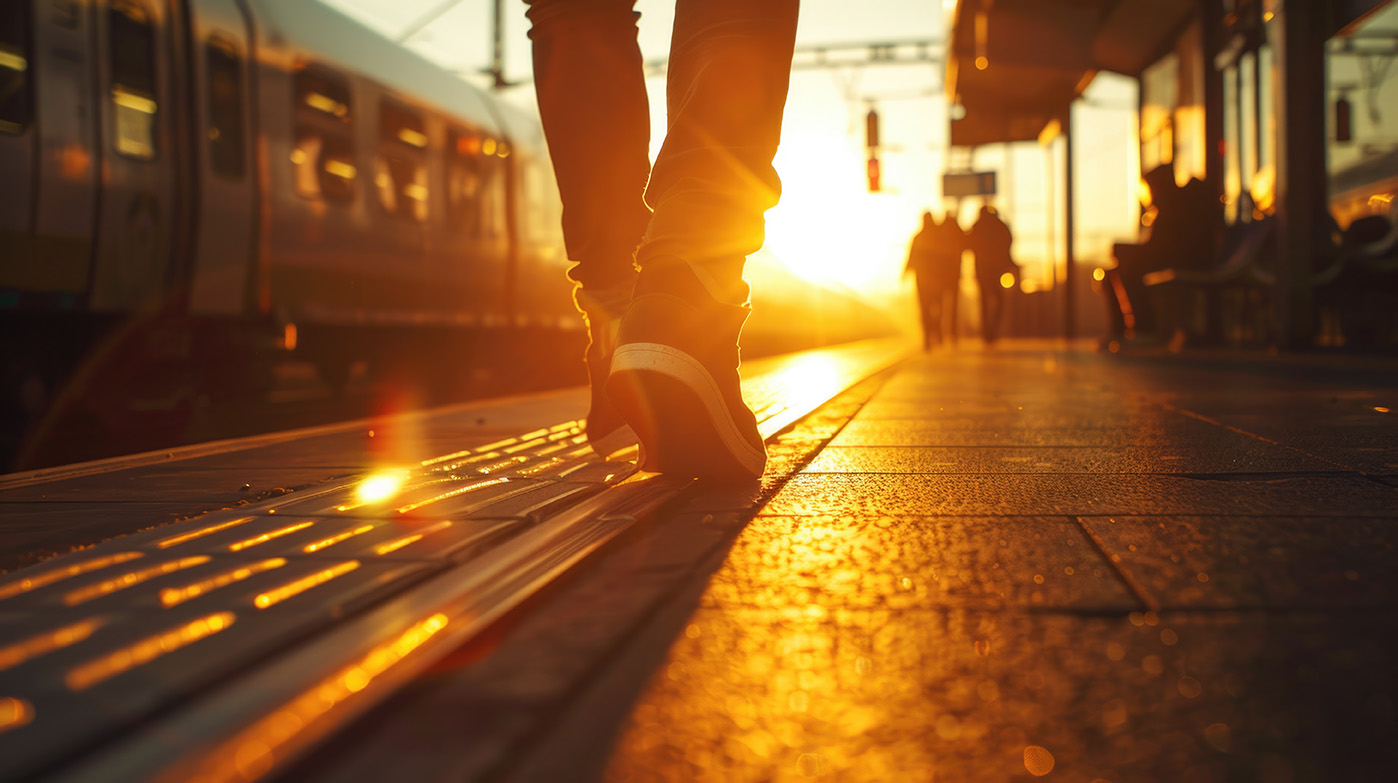
Traveler walking along a train platform at sunset
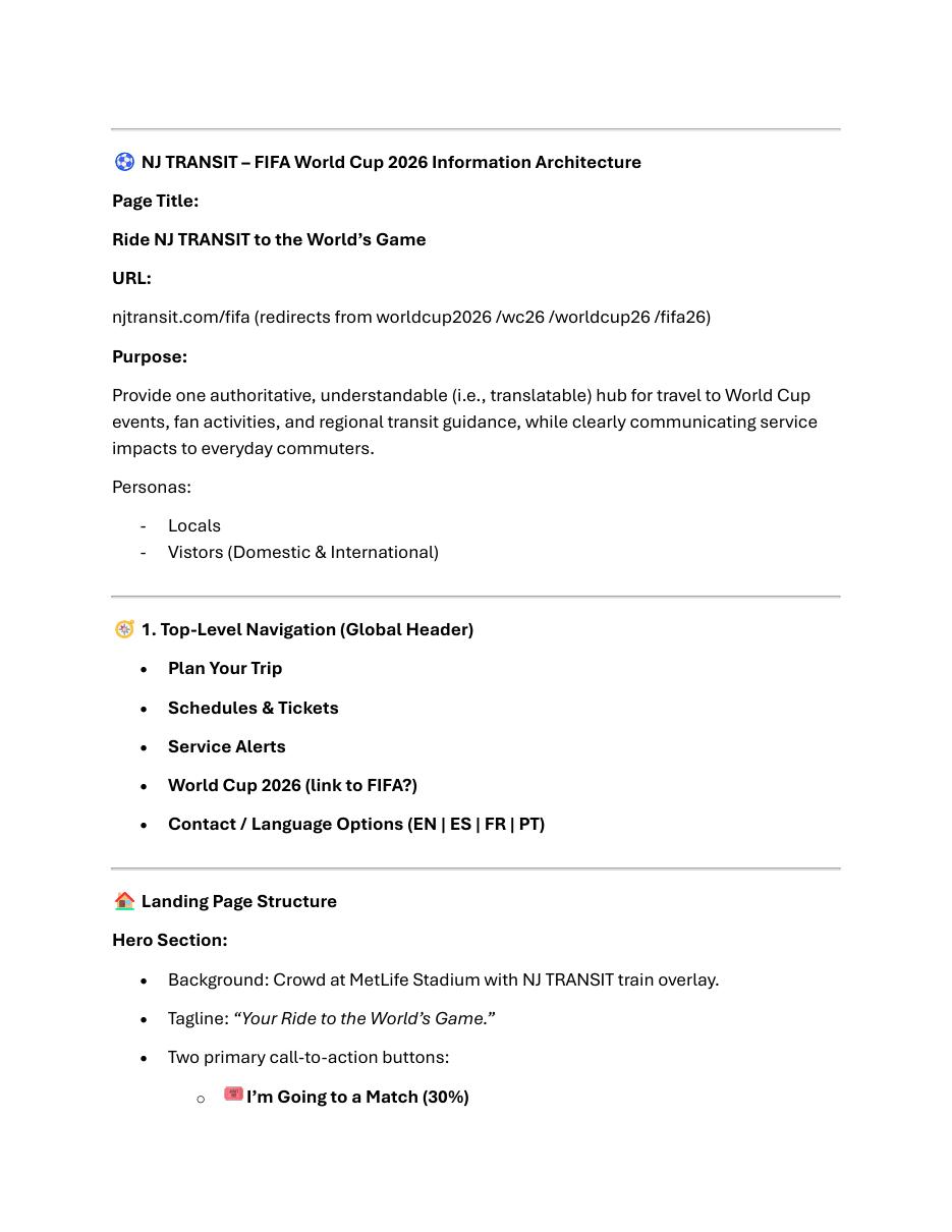
Information architecture

Organize around why someone came.

The site did not ask every visitor to understand NJ TRANSIT's internal structure. It organized the journey around intent: going to a match, visiting the region, or commuting on NJ TRANSIT.

That simple decision gave a very large amount of content a clear front door.

NJ TRANSIT World Cup information architecture
NJ TRANSIT World Cup information architecture detail
The visual system

Useful did not have to mean boring.

The design had to feel unmistakably connected to NJ TRANSIT while carrying enough World Cup energy to feel like part of the event. Bold color, photography, clear pathways and highly legible type helped the experience feel approachable instead of institutional.

Two worlds

NJ TRANSIT familiarity with the energy of an international sporting event.

Clear pathways

Matchgoers, visitors and commuters could quickly identify the route meant for them.

Color as structure

Color helped orient people through the experience instead of serving as decoration alone.

NJ TRANSIT World Cup mobile screen
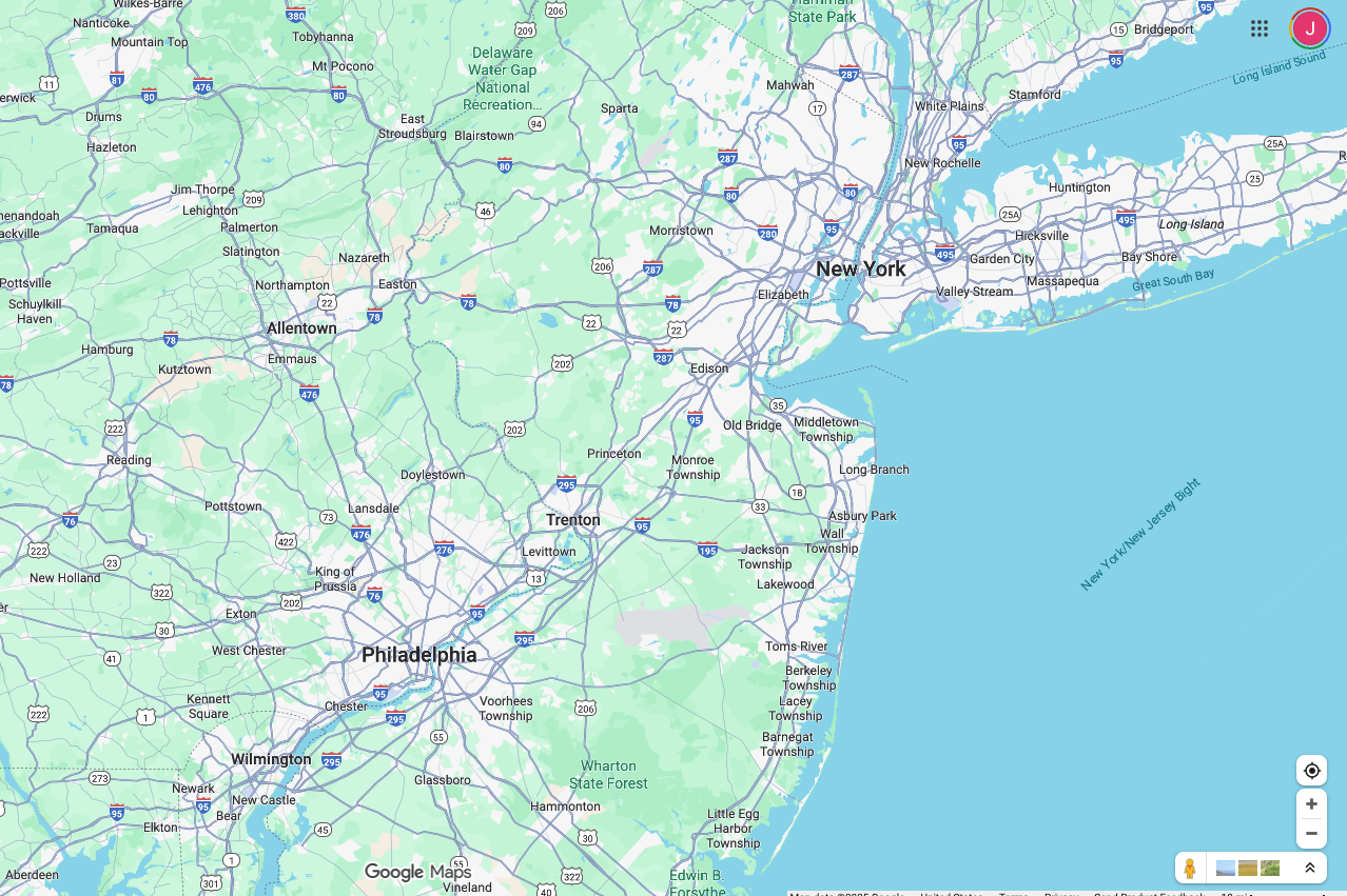
Regional NJ TRANSIT World Cup map
The scale

One experience. A lot of different journeys.

Fans traveling to matches, visitors exploring the region and regular commuters all needed different answers. The final experience brought those paths together without flattening them into one generic flow.

See the live experience
The part I liked

They could have gone corporate. They didn't.

The client chose the dynamic direction. That gave us room to build something professional and practical without stripping away the excitement of the event.

The finished site became a single destination built for a massive audience and a complicated real-world transportation problem. For a project with that much information, making it feel simple was the win.

Back to

Sun Responsibly